Best Buy Marketplace Logo
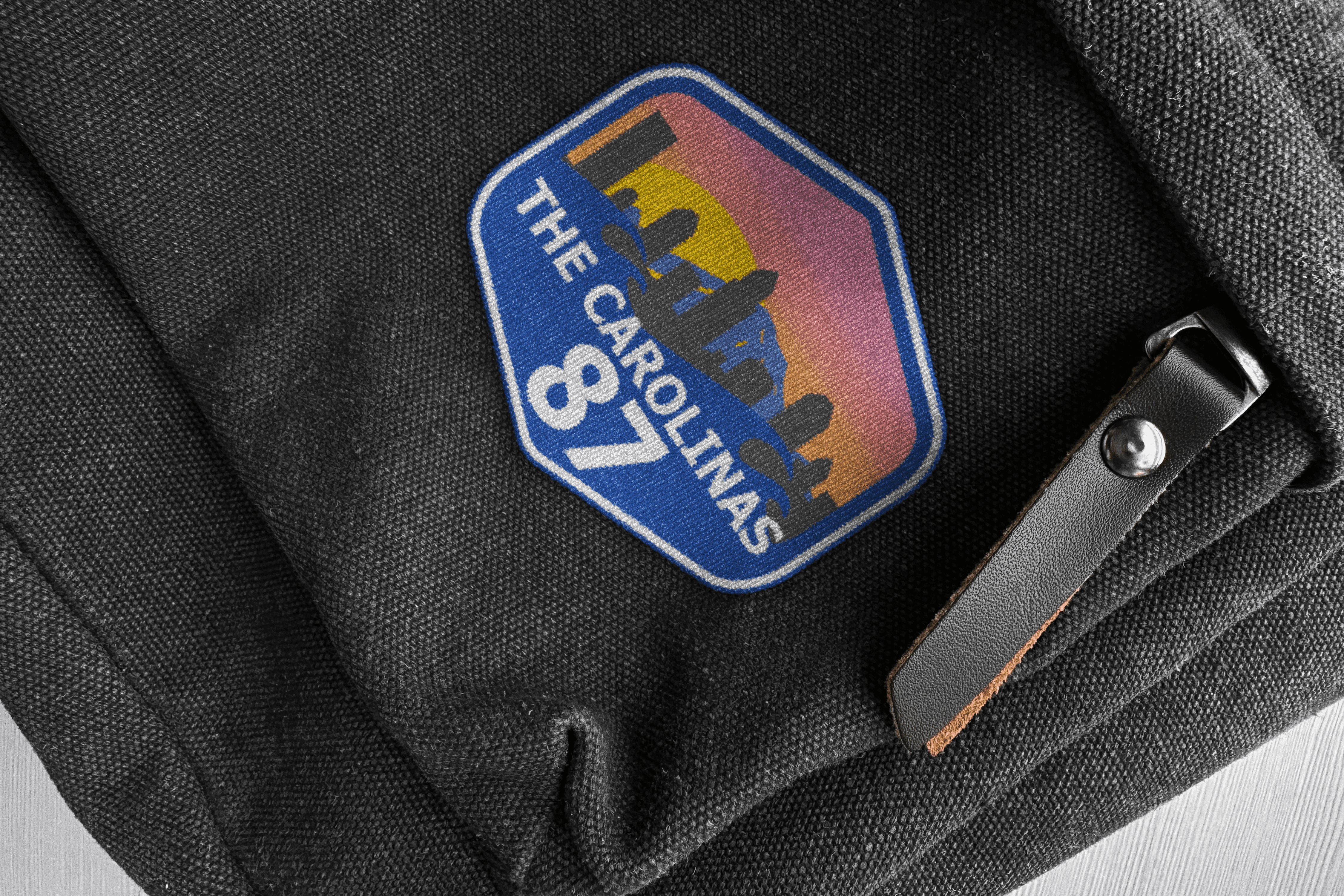
Best Buy Marketplace 87, representing stores across North Carolina, South Carolina, and Virginia, needed a refreshed logo that maintained its established identity while introducing a more modern, regional look.
The goal was to preserve recognizable elements of the original design while creating a logo that could represent the marketplace across internal branding and merchandise.

The redesign retained the original badge-inspired shape and Best Buy's recognizable brand colors while incorporating elements representing the marketplace's geographic region.
I explored ways to combine a city skyline, mountain landscape, and ocean waves into a single composition. After developing initial concepts and color variations, I refined the design by layering the landscape elements and introducing a gradient inspired by a Carolina sunset.
These changes created a more unified composition while maintaining the regional identity requested by the client.
I worked directly with Brandy, the Marketplace 87 leader, throughout the design process. She provided the initial creative direction, identified elements to preserve from the original logo, and offered feedback on the concepts.
I was responsible for concept development, illustration, color exploration, and revisions. Through collaborative feedback, we refined the badge shape, adjusted the landscape composition, and finalized the color treatment to align with the marketplace's vision.


The final logo was approved and adopted as the primary identity for Best Buy Marketplace 87.
The design was implemented across marketplace branding and reproduced on merchandise, including stickers and embroidered patches, extending its use beyond digital applications.